

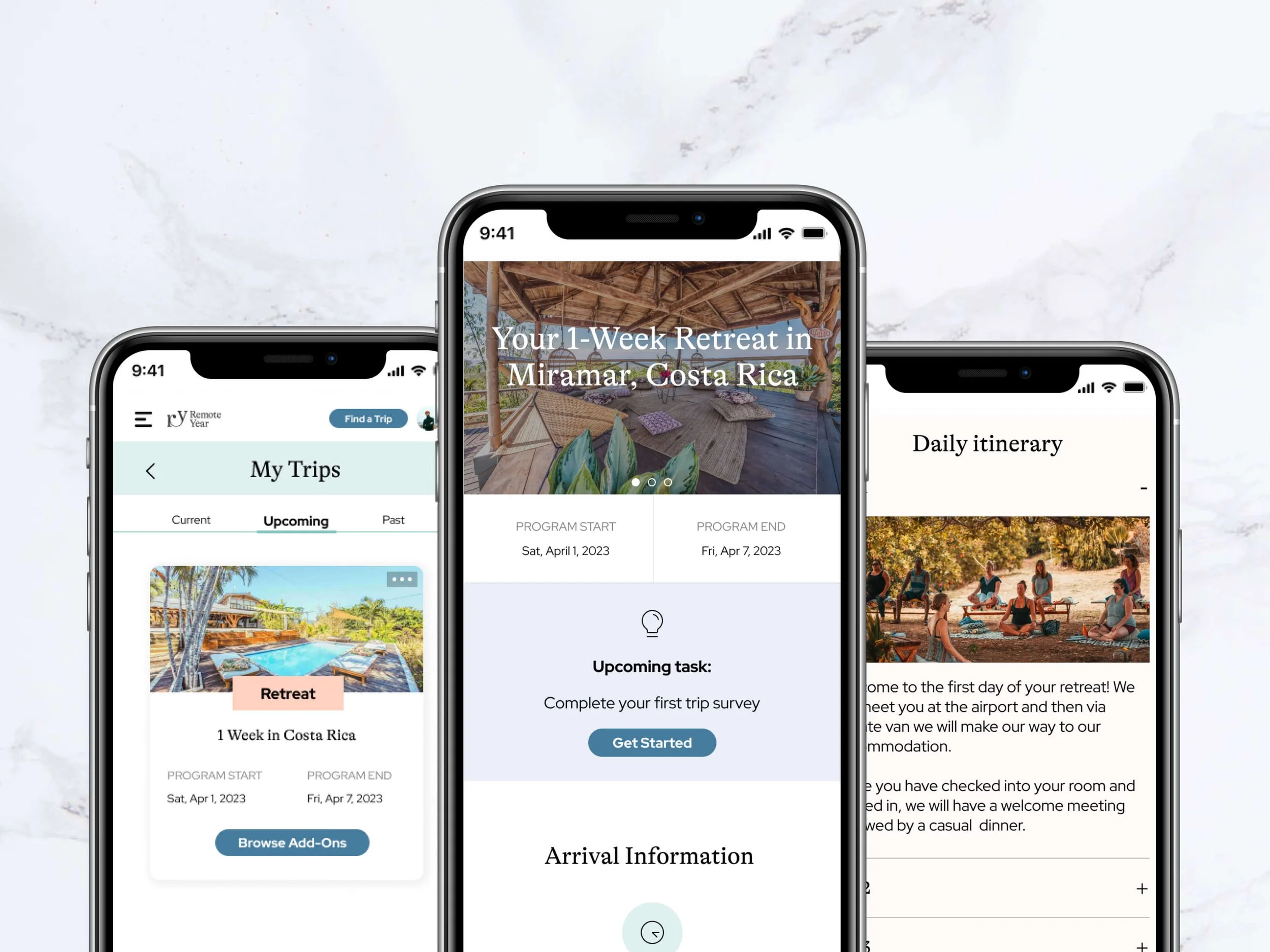
User Dashboard - My Trips
Main tasks as the sole UX/UI Designer
User interviews to collect relevant information
Sketching, Wireframing, Prototyping
Collaboration & Iterative Process with Engineers, PMs, Operations Team
The Problem
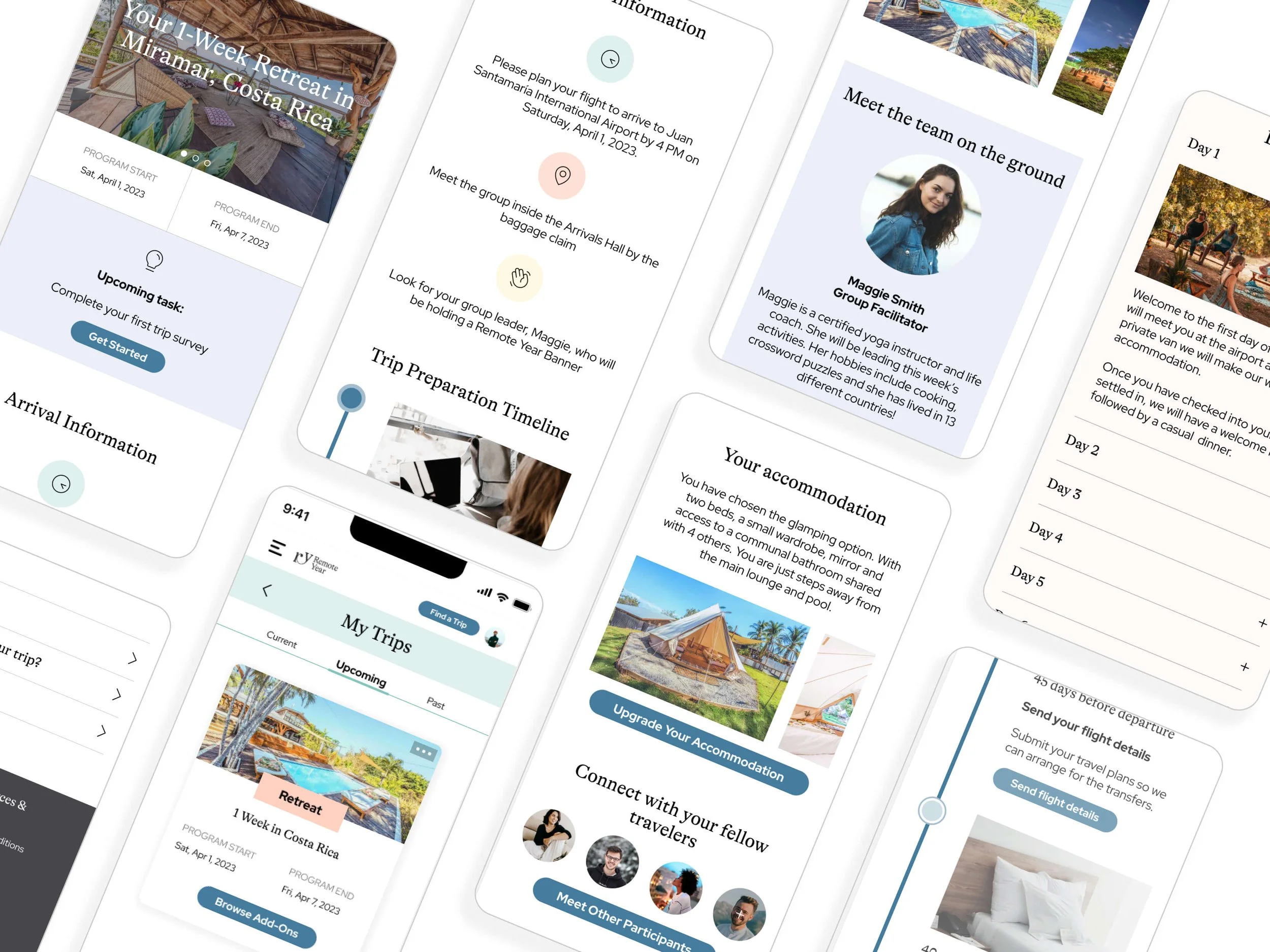
Users with upcoming trips needed easy-access information with all relevant details to feel prepared for their departure. Historically, all this information used to be communicated through an onboarding email series, but users were not opening all of the emails and missing key points. Therefore, I was tasked with building a trips tab within the user’s dashboard containing all relevant information in one centralized location.
Discovery & Sketching
In order to design a successful dashboard I had to collaborate with the Onboarding, Operations and Sales Team to ensure I was capturing the key points that needed to be communicated prior to a trip departures.
Since all onboarding and pre-departure information used to be delivered to the clients in a series of emails, I went through the existing onboarding journey with all relevant departments to see how we could consolidate the information.
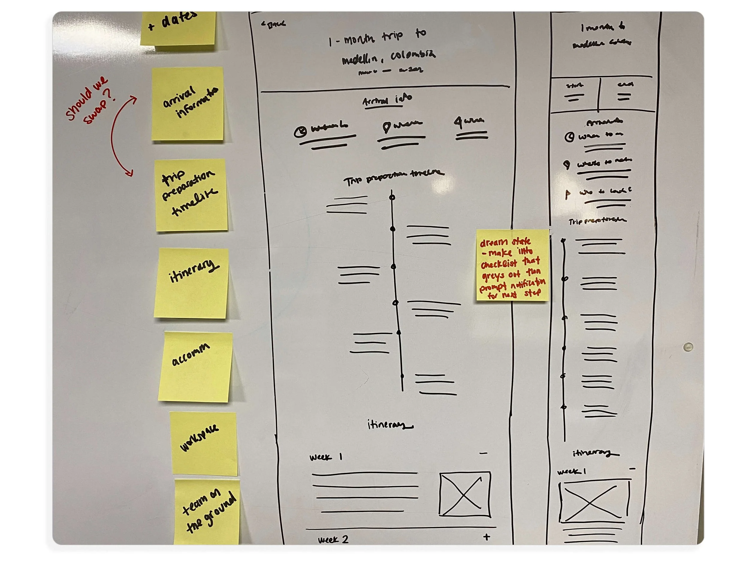
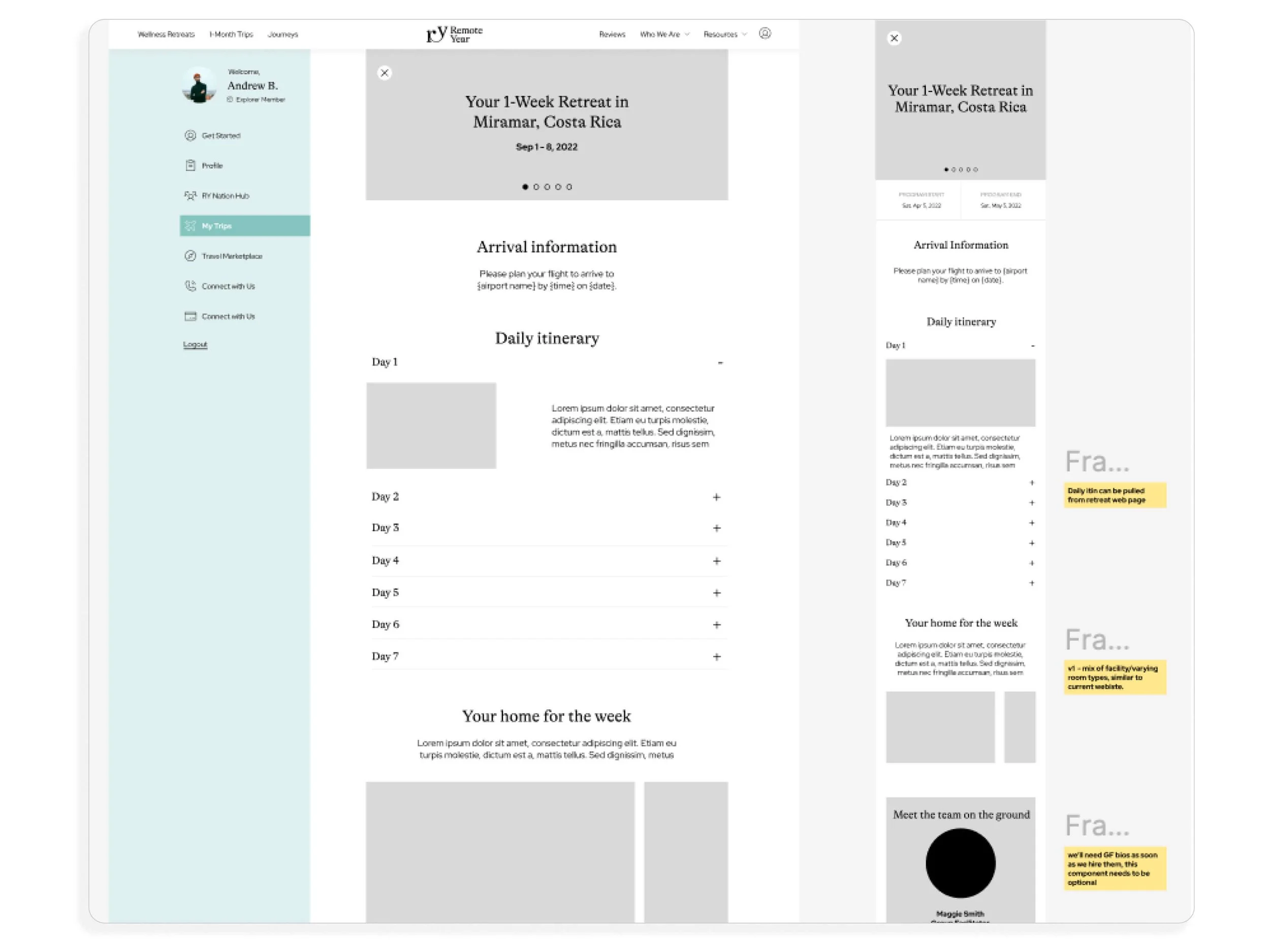
Wireframes
Originally we had it as a pop out field within the “My Trips” tab of the user’s dashboard, but once the wireframes were created we realized that it would be better to have it as its own screen.
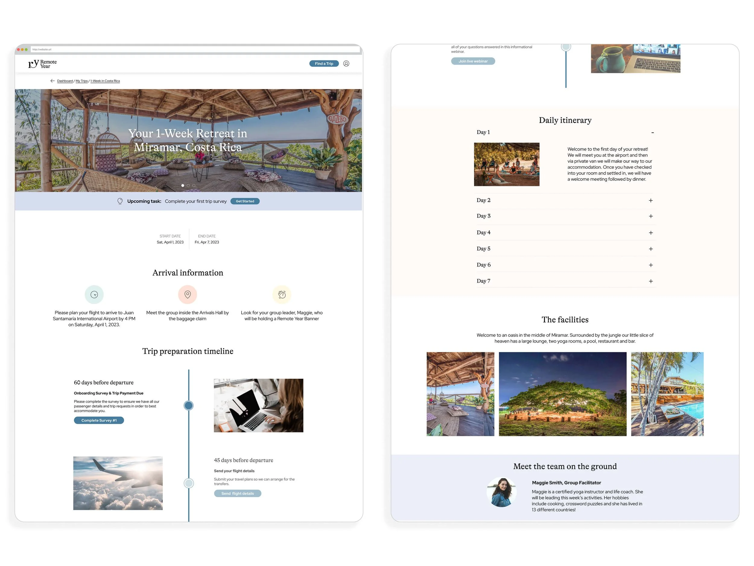
Desktop Version
Also, after a round of user interviews conducted with mid-fidelity wireframes, we implemented several new features:
Upcoming task prompt with CTA for ease
Built out arrival information
Added a trip preparation timeline to ensure that users completed all necessary steps prior to their departure. This is an interactive element that is unique to the user and follows their tasks completed vs those still outstanding
Daily itinerary overview
Meeting the team on the ground with short bios
connecting with fellow travelers on the trip prior to the trip
Having the option to upgrade their accommodation option directly within the dashboard rather than needing to email in
Mobile-First Design
Based off our heat maps and data tracking we saw that users were predominately viewing their dashboard from their phones. Therefore we ensured that it was a mobile-first design that then also adapted for desktop.