

Chop: Virtual Chef Connect App

Overview
App Summary
Chop is a cooking expert app that allows users to connect virtually with a professional chef via chat, phone or video call to solve all their culinary needs. Whether you need help with a tricky recipe or want to improve your basic cooking techniques, top chefs are just a click away. Think of the concept behind Airbnb, but instead of searching for the perfect apartment and booking your getaway, you are searching for an expert chef and booking a virtual lesson!
My Role
Concept Creator and UX/UI Designer
Tools
Adobe XD, Indesign, Illustrator, Photoshop, OptimalSort, Survey Monkey, Usability Hub
My Process
Iterative Process
I implemented a user-centered design thinking process that focuses on solving user needs and pain-points while also prioritizing the business requirements.

01. Research
Defining the Problem Statement
Our home cooks need a way to connect with a professional chef because they wish to learn how to cook a new dish or master a new culinary skill.
Hypothesizing a Solution
Create a service that functions across various platforms and allows users to specifically to connect with culinary experts to help them perfect a simple recipe or technique, and allow them to customize it to their dietary needs.
Creating a Competitor Analysis
There is currently no other cooking expert apps available. Therefore, I chose to review a mix of cooking apps and other expert apps.
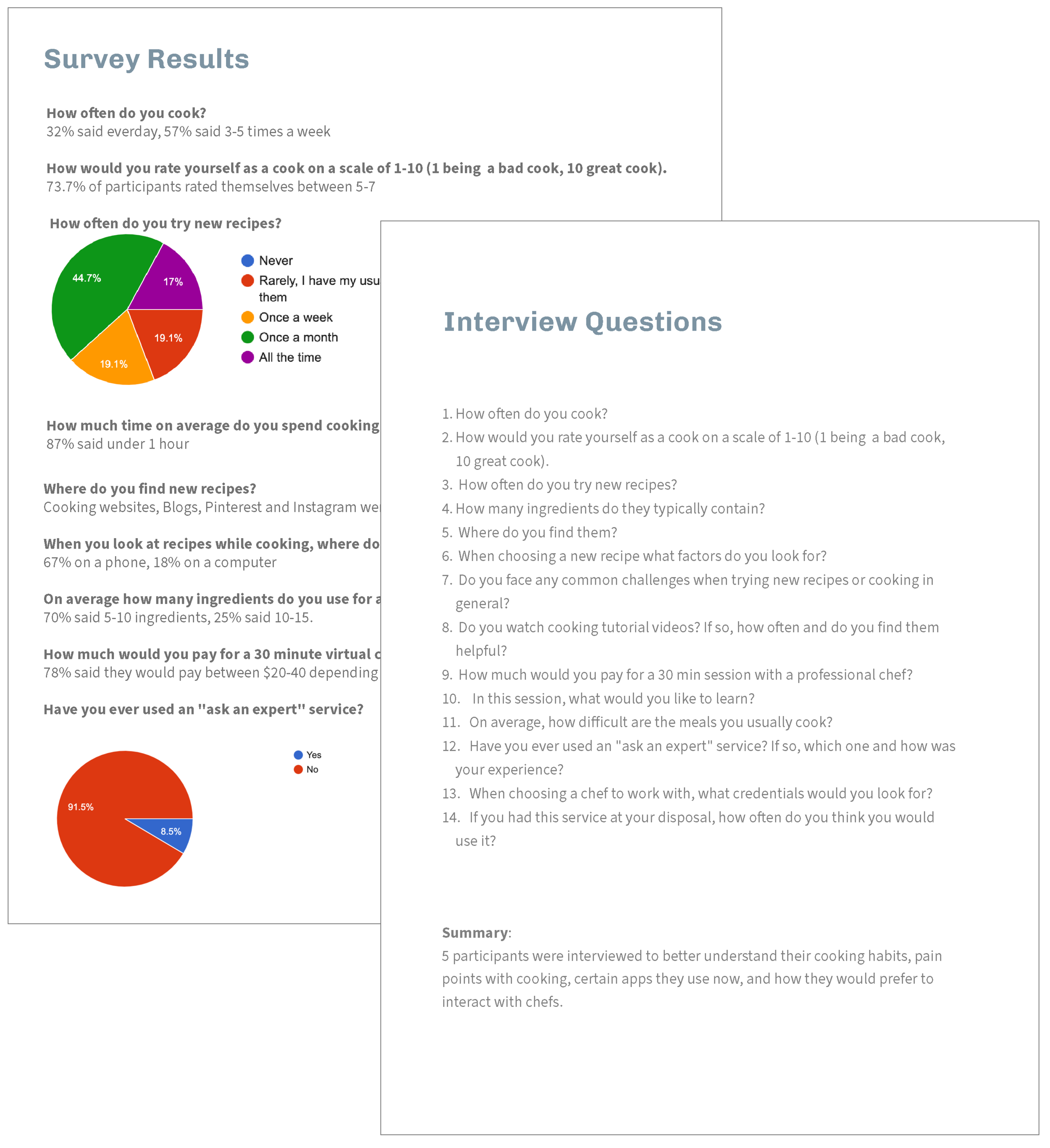
Conducting User Surveys & Interviews
Survey with 53 participants and 6 user interviews to discover patterns, cooking habits, behaviors, challenges and needs.
Analyzing the Data
Organized results with card sorting and affinity mapping.

02. Define
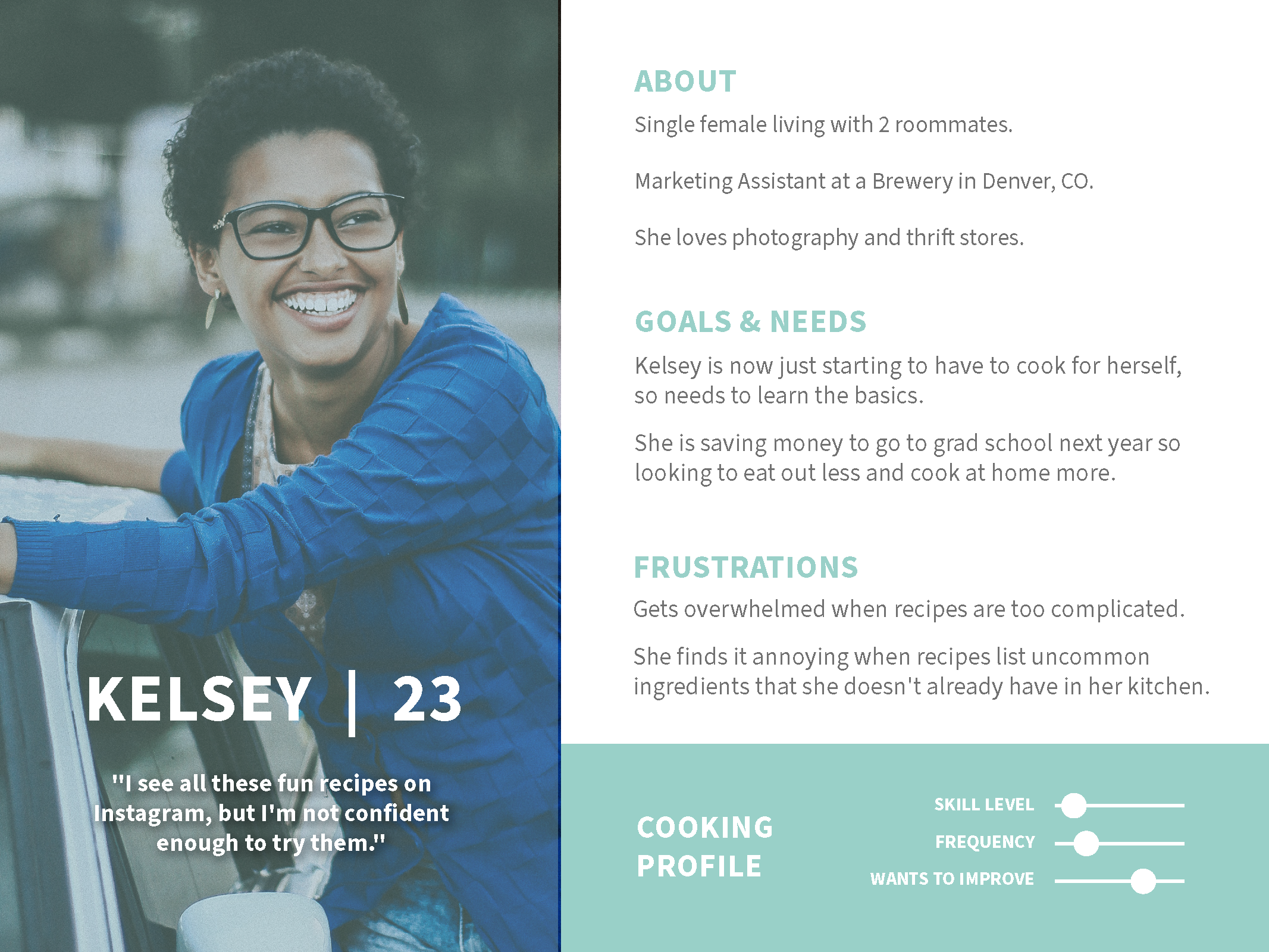
Developing User Personas
Based off data results, I created 3 User Personas. Kelsey: The Novice | John: The Master Chef | Prisha: Average Cook


Defining User Journeys and User Flows
It was time to see what kind of tasks users would actually need to complete within the app and their journey as they did so.


03. Create
Sketches & Wireframes
I began with sketches in order to feel out the basic elements and screen layout without getting caught up in the details. Once I was happy with the overall impression of the sketches, I translated those into mid-fidelity wireframes using Adobe XD.

Mid-Fidelity and Early Prototyping
Now that the user flows were officially in a digital form, it was time to start adding more detail so testing could commence. In this round of iterations I focused on building out the onboarding process so the user’s home feed would be more personalized to their preferences.

04. Test
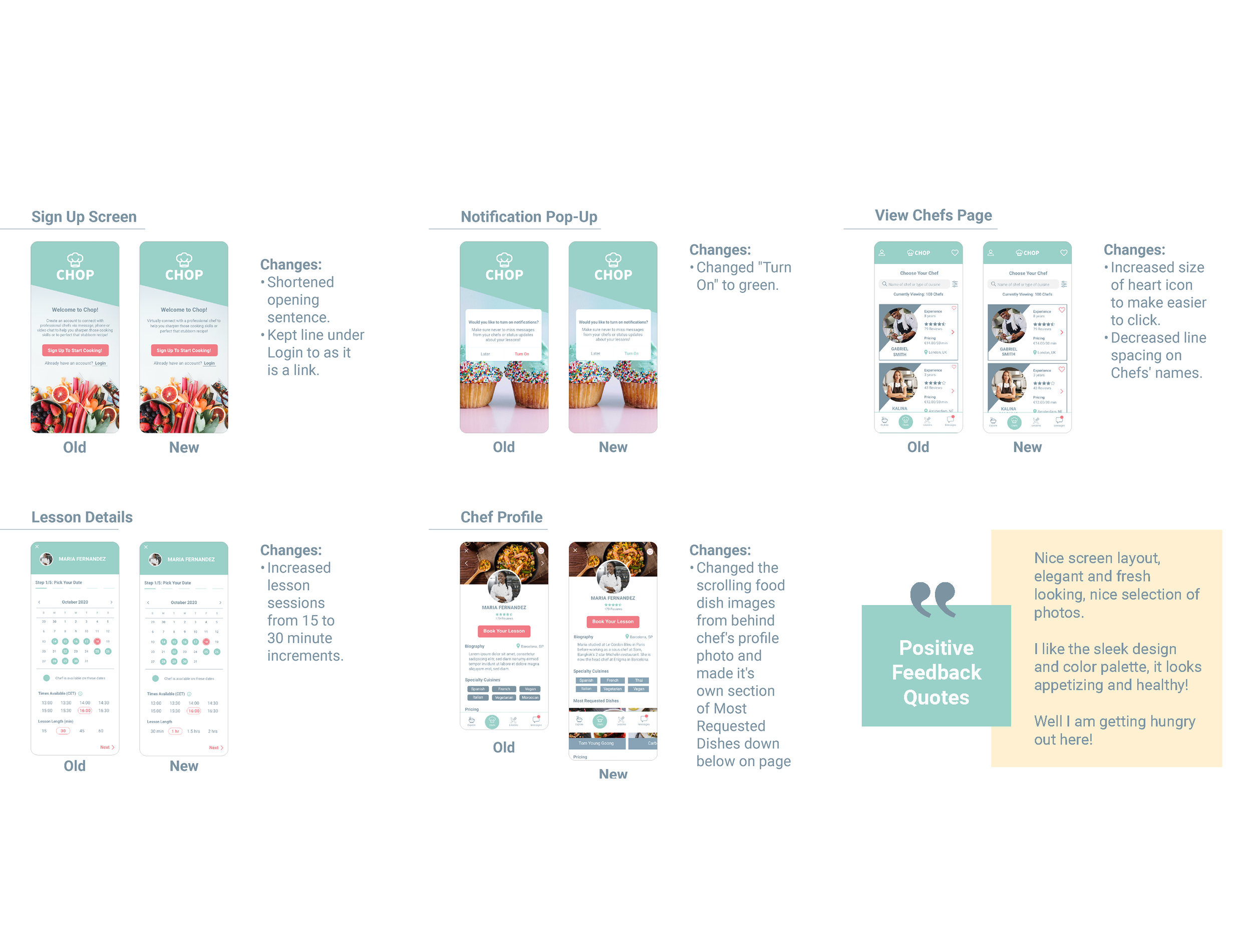
Moderated User Testing
I conducted 6 moderated remote tests in which I could see the participants’ reactions as well as capture their screen movements as they completed 3 different tasks. Analyzed the results with affinity mapping and rainbow spreadsheet to easily allow me to classify and rank errors based on their severity level


Iterations
The navigation of the app was proving to be intuitive and the ease with which all 6 participants completed the tasks validated my current design decisions. However, 3 key issues discovered.
Issue 1: Skipping the onboarding process
Problem (Medium): Although not technically wrong, 3 of the 6 users immediately went to click “Start Cooking” instead of reading the onboarding screen.
Change: Based off user feedback, the onboarding isn’t needed and just makes the opening screen cluttered, so cut it completely to focus on Sign Up button and making the onboarding process more enjoyable for the user

Issue 2: Unclear layout of Chef Profile Page
Problem (High): All users took a minute to locate the “Book A Lesson” Button on the chef’s profile page as originally they had to scroll all the way down to the bottom. They also wanted to know the chef’s specialty dishes.
Change: I moved the button up to the top of the page so it is easy to find, and added a scrolling image library of the chef’s top dishes behind their profile picture.

Issue 3: Unknown Timezone
Problem (High): 2 users asked how would they know what time zone the lesson was taking place in.
Change: I have added the time zone to the booking page as it will auto-populate to where the user is currently located. It is listed with an info button that will produce a pop-up box if the user clicks on the icon.
05. Develop
Finalizing the Style Guide
Now it’s time to lock in the UI elements and finalize Chop’s style guide.


High Fidelity Prototypes
Finally time to apply the UI elements to the wireframes in order to get Chop ready for another round of user testing.

Unmoderated User Testing
5 people participated in an unmoderated remote test of the interactive prototype, and left feedback in the comments touching on everything from design aesthetic to functionality.

Feedback & Iterations
5 people participated in an unmoderated remote test of the interactive prototype. Here are the changes I made based on their feedback.
Next Steps
The next steps for chop will involve building out more user flows and the other various areas of the app such as the lesson portal. Once these have been developed, it will be ready for hand off to developers. As the app continues to develop, it will undergo constant user testing and iterations to continue to validate design updates.
Key Learnings
The more user testing and feedback the better! Quick rounds of iteration and testing lead to problem-discovery and solution-creation and truly validate all design decisions made along the development journey. Keep it simple until you’ve worked out the kinks! To not get caught up in small details while needing to still focus on big-picture.
