CaringOnDemand Apps, Admin Desk & Marketing Collateral
Project Overview
CaringOnDemand had 2 existing mobile apps and an admin desk formatted for desktop. They were undergoing a company rebrand and decided to update the UX and UI of their existing apps, along with their print and digital collateral.
Company and the revamped apps were featured in Yahoo! Finance. Read article here.
Deliverables: 6 Months
2 Mobile Apps from concept to completion
Updated visit and calendar menu items along with new notification design for admin desk
print and digital collateral
presentation decks
Old Apps and Admin Desk
Key Problems with Old Apps
There were 3 apps: one for clients, one for family members and one for caretakers causing confusion for the users
Clients could only book one visit at a time
Clients couldn’t edit a visit request within the app
Clients couldn’t add or update a payment method
Colors didn’t pass accessibility testing on any of the apps
Caregivers in their app couldn’t access their schedule easily
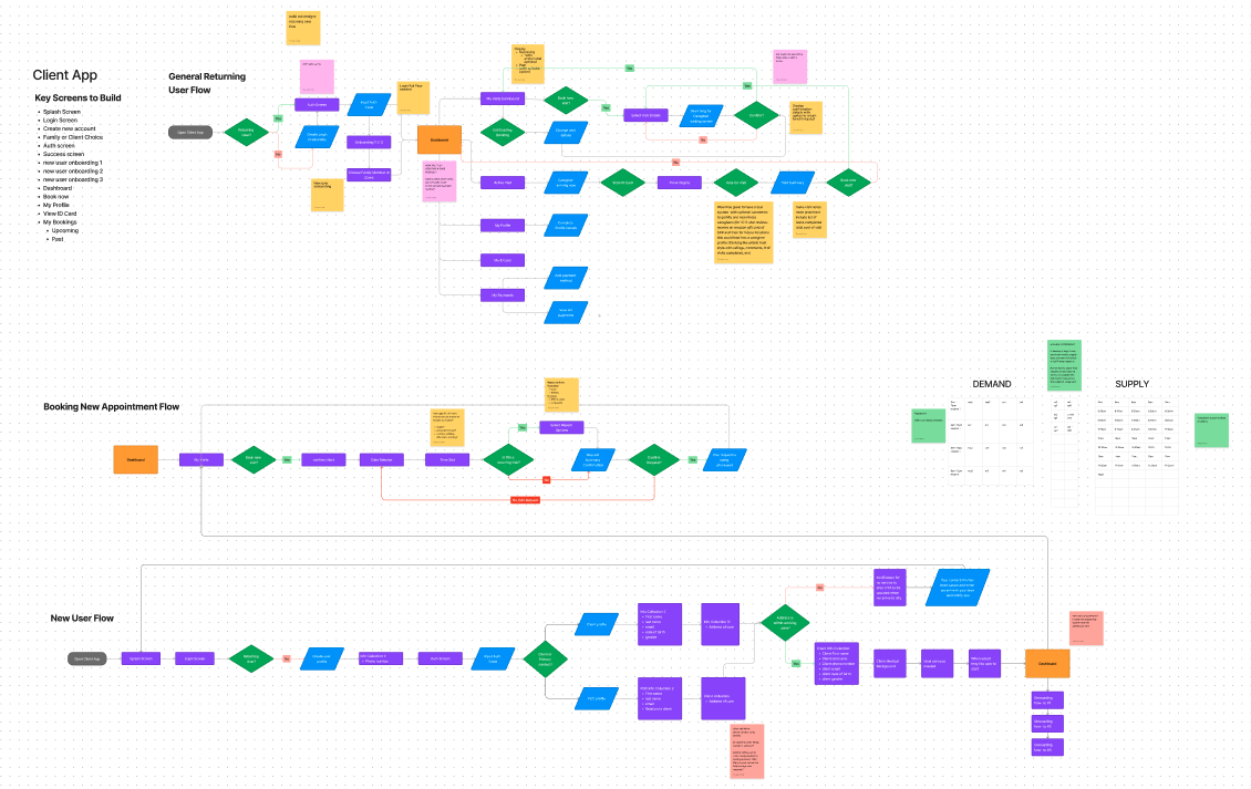
New User Journeys
The old app consisted of very few features and the client wished to build out the user’s experience within the app. So I was able to create new user journeys meeting the clients’ needs while also keeping the app simple as the key user is a 50+ year old person caring for their aging family members. Based on user testing and feedback, we wanted to keep the app as straightforward as possible since the level of comfortability with technology wasn’t very high amongst the clients.
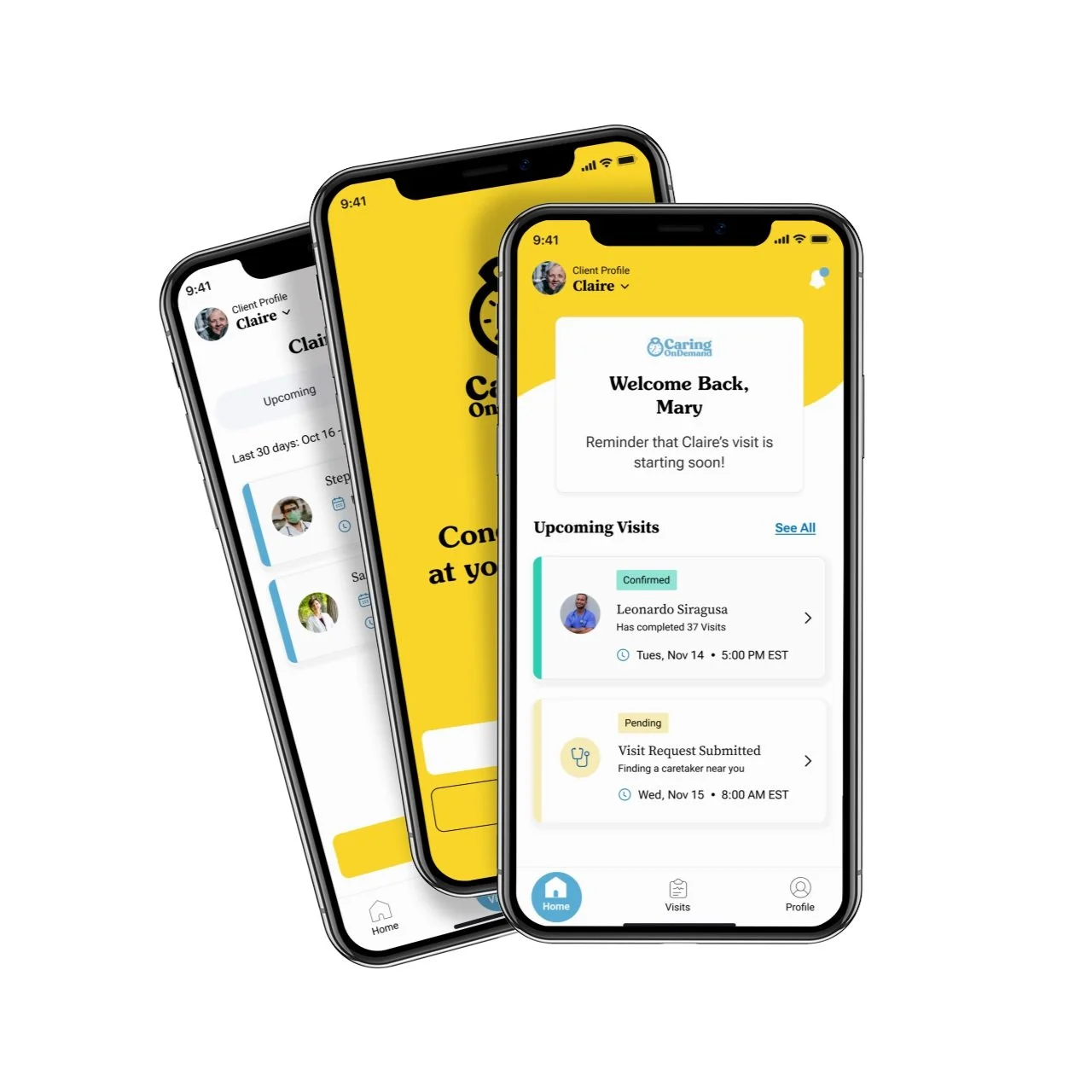
New Client & Family Member App
Solutions Implemented
Consolidated the Client and Family Member app into one and allowing users to create multiple client profiles within the app. This ensures that if a family member is overseeing the care for multiple loved ones they can manage and edit all requests within one app.
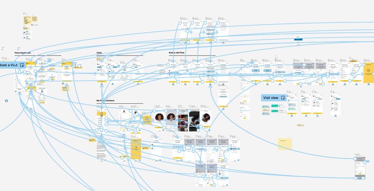
Added a repeat visit feature and new booking flow that allowed users
The option to add/select/edit multiple payment options
Users can now see their upcoming and past visits, visit details, caregiver details
The ability to cancel or edit a visit request and add a confirmed visit to their existing linked calendar
Built a new notification center so users can stay up to date with the status of their visit requests and other pressing updates
Added an onboarding flow to help new and returning users orient themselves within the new app
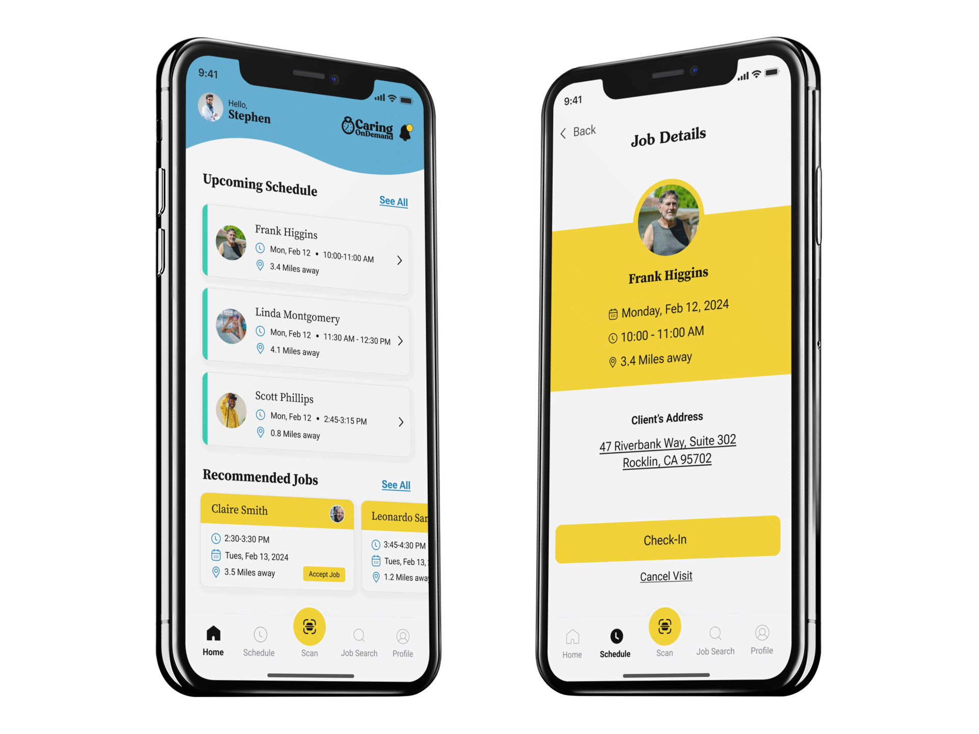
Caregiver App
Caregiver App Improvements
Besides applying the new branding, Caregivers can see now easily see their schedule
Added a section for recommended jobs so jobs can be filled faster
Visits can be automatically synced with a Caregiver’s calendar
When they view the Clients’ details it will open automatically their default map app so they can easily navigate to their next appointment
Added a SCAN feature to the bottom nav bar as that is their main action item in order to begin a visit.
Added notification center so they can stay on top of job status requests
Admin Desk
Add New Visit Flow
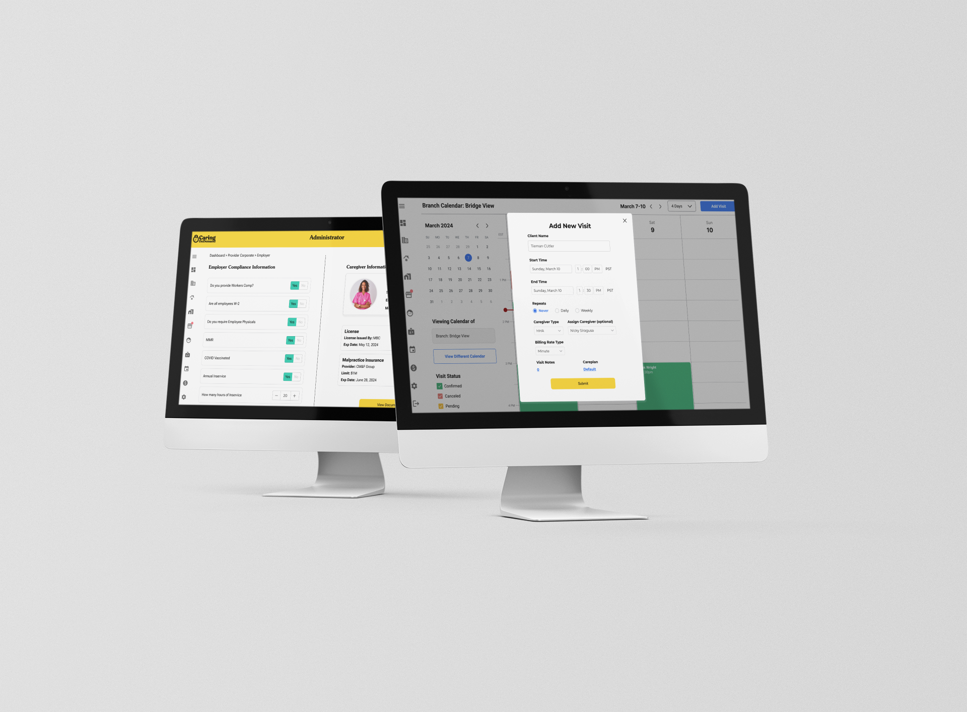
Previously users were struggling to manually add a new visit from the admin desk. With the new calendar view now they are able to sort by Client, Caregiver or Provider allowing for a more precise overview of upcoming visits. With the new add visit flow, the schedule can now easily be managed directly from the admin desk.
Caregiver compliance
A compliance screen was built to ensure the providers and their employees met all the necessary requirements of a certain elderly community.
Notification system
Added notifications so users can easily see when a job is available for their team or when something pressing like a caregiver’s license is expiring soon ensuring all caregivers remain valid while employed.
Marketing Collateral
In addition to creating their new apps, I was tasked with updating all their digital and physical marketing materials to incorporate their new brand identity. Examples below include partner proposals for companies such as Best Buy Health, new business cards and giveaways for conventions.


