
Rebrand and Redesign of Remote Year’s Website

Main tasks as the sole UX/UI Designer
Competitor Analysis & Persona Creations
Site Map & User Stories and Journeys
Sketching, Wireframing, Prototyping
User Interviews & Testing
Collaboration & Iterative Process with Engineers, PMs, Content Team and C-Suite stakeholders
The Problem
When I began working with Remote Year, they had just undergone a full rebrand: colors, logo, typeface and styling, and their old site was built on a Webflow platform. They wanted to build the site from scratch using Contentful as the CMS.
I was given the task of creating the new site from concept to completion while incorporating the new branding.
Old Site and Branding
This was the existing site when I joined the team. I was hired to apply the company’s new branding while improving the user experience and increase digital conversions.
User Interviews
Conducted user interviews from users who were unfamiliar with the product. Using affinity mapping I was able to pull the key insights into the old site to drive design decisions in the upcoming wireframes.

Affinity mapping based off user questions/feedback

Competitor Analysis


Creating User Personas & User Journeys
Defining the user to see how potential customers would view the site and navigate to different areas. This was followed by defining User Journeys which in turn lead to the creation of the new site map.
Sketches & Wireframes for New Site pages


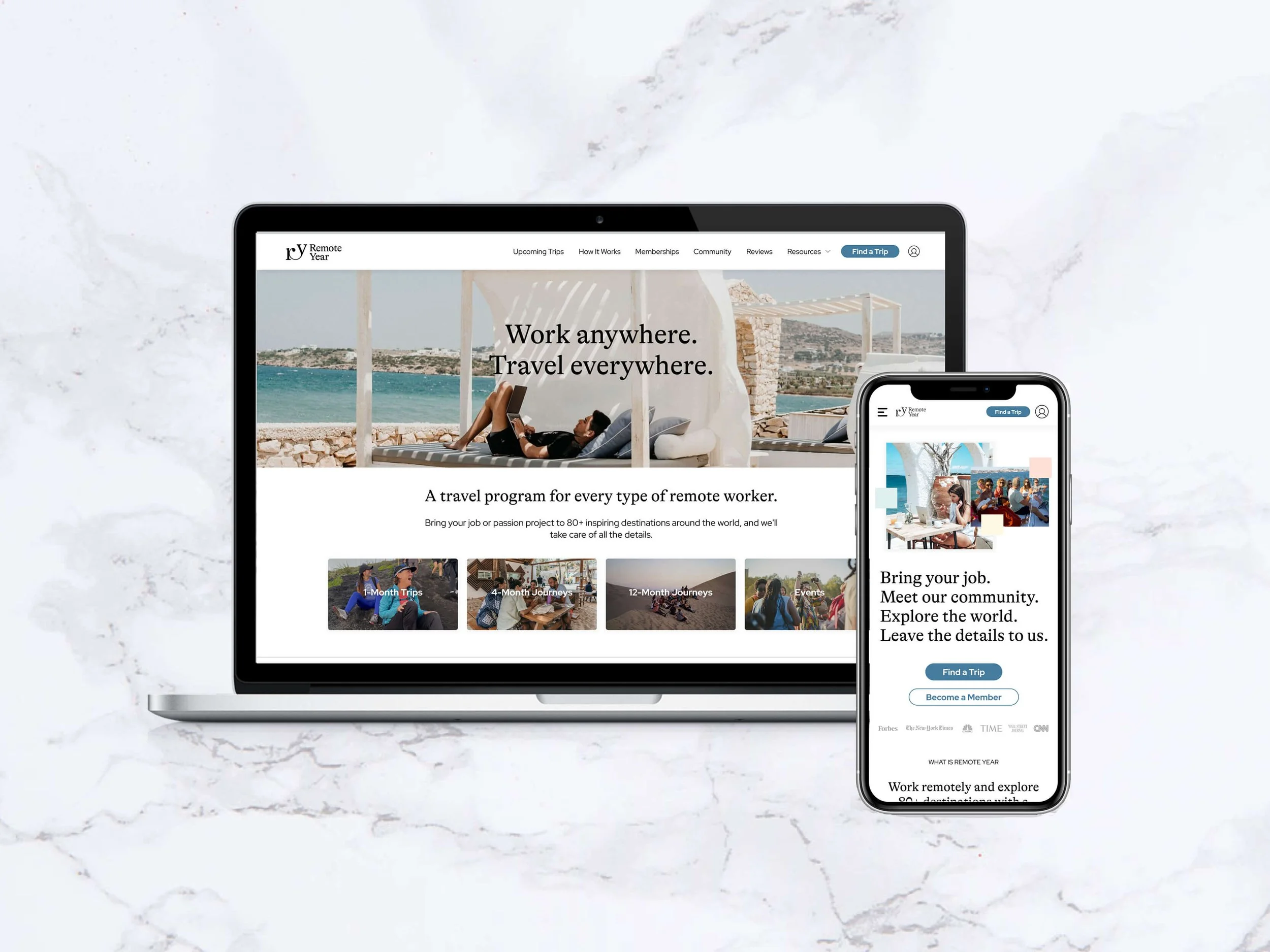
Home Page Redesign


Trip Page Redesign
Key issues in old design
Video background caused for slow loading time causing high bounce rate
Confusing user-journey in which people could not find their desired trip easily
Low contrast in copy not passing accessibility tests.
Inconsistent image and icon sizes
Jarring color palette and lack of content hierarchy
The solutions incorporated into the new designs
Redesigned the site-map to reduce journey by 4 clicks to reach checkout page
Implemented new branding style that proved 100% more inviting to users based off user survey results
Solved main users’ problems of being able to find their desired trip by designing a search and filter page
Organized content hierarchy of trip page based off user research addressing their key questions first while adding in a floating CTA to drive users further down the funnel with ease.
Added a jump nav on the page to allow users to navigate to their desired section without having to scroll and search the whole page
Focused on bringing diversity into the pictures to emphasize the core inclusive values of the company.

New Filter Page Design
Added in a filter page to allow users to easily find their desired trip while simultaneously preview all possible options if they were looking to book multiple at once.

Lead Capture Screens
At two points throughout new user’s journey we placed a lead capture
First in the form of a pop-up upon exit-intent
The second part-way through the booking flow. By implementing these screens, we were able to filter users into two different sales funnels based off product intent or general interest.
Accommodation Selection Page
In order to drive users further down the funnel, we removed the accommodation information from the main trip page and now gave customers the chance to select their accommodation type prior to checkout (previously it was done 60 days prior to departure via email).
