Back Office Management System
Main tasks as the sole UX/UI Designer
Site Map & User Stories and Journeys
Sketching, Wireframing, Prototyping
Collaboration & Iterative Process with Engineers, PMs, Operations Team and C-Suite stakeholders
The Problem
The operations and sales department needed an internal, centralized tool to track bookings, users, upcoming departures, and inventory since before they manually updating google sheets which lead to human error and not having live time information.
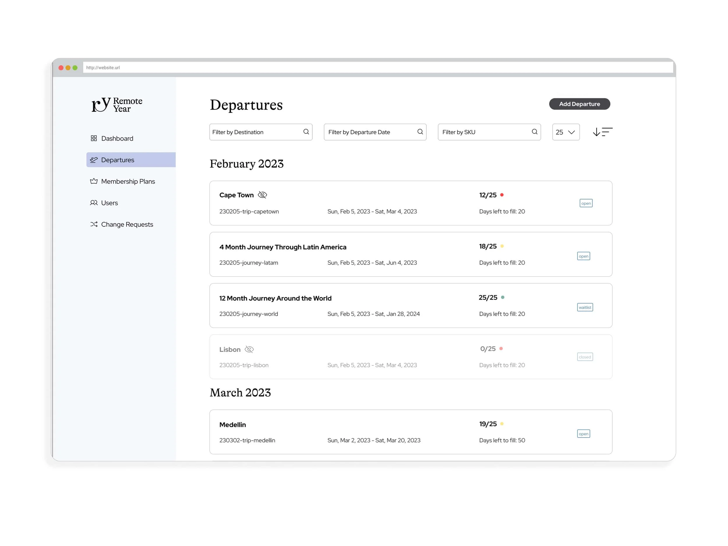
Departures Overview
The departures tab will display all upcoming trips and at a quick glance provide the necessary information regarding that departure:
Destination
Dates of operation
Internal code
Current capacity
Days left to full the trip
Status on marketing website (open, waitlist, closed)
We also implemented 5 different filters at the top for ease of search, and an “Add Departure” CTA to more efficiently add upcoming trips.
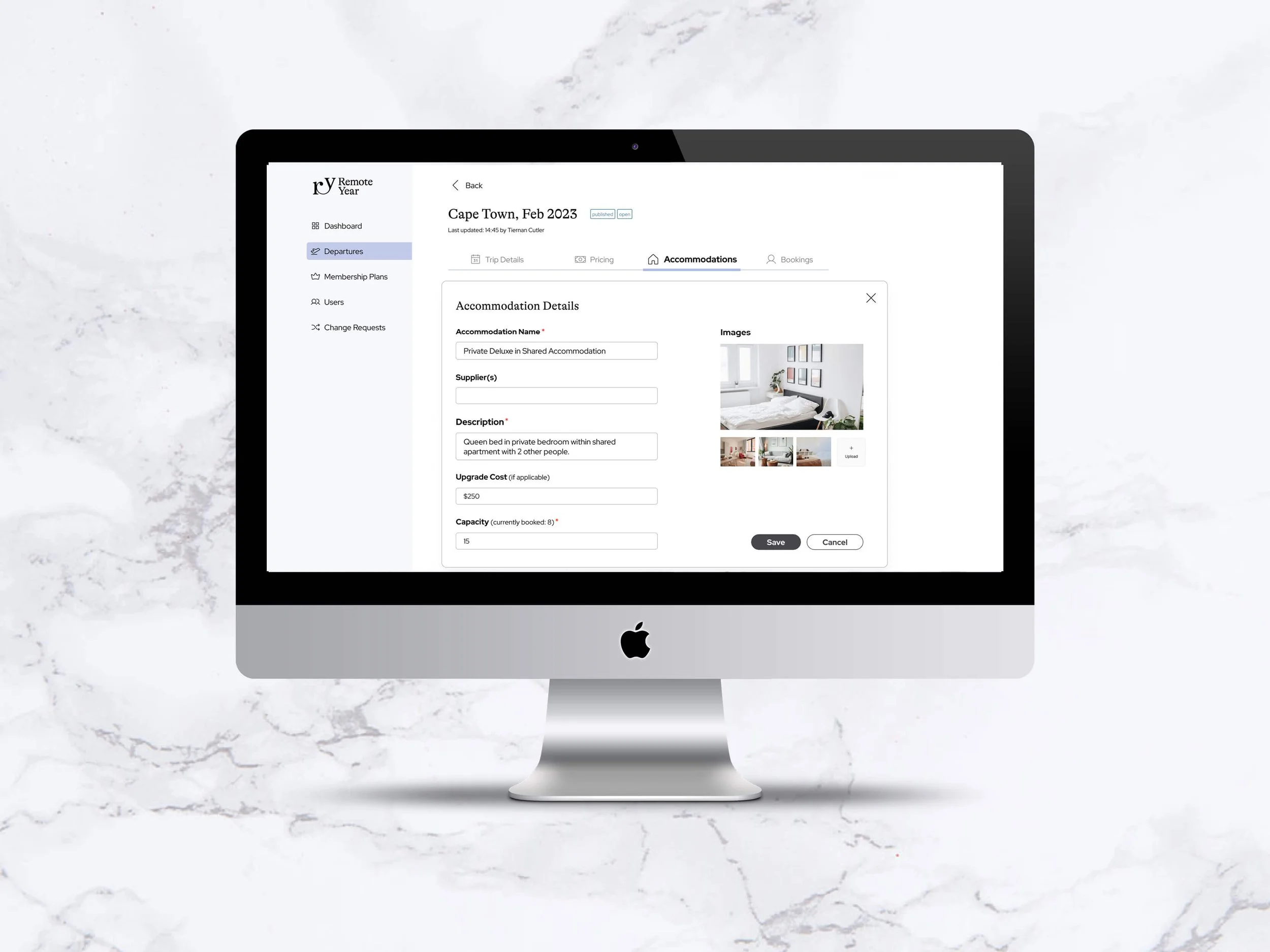
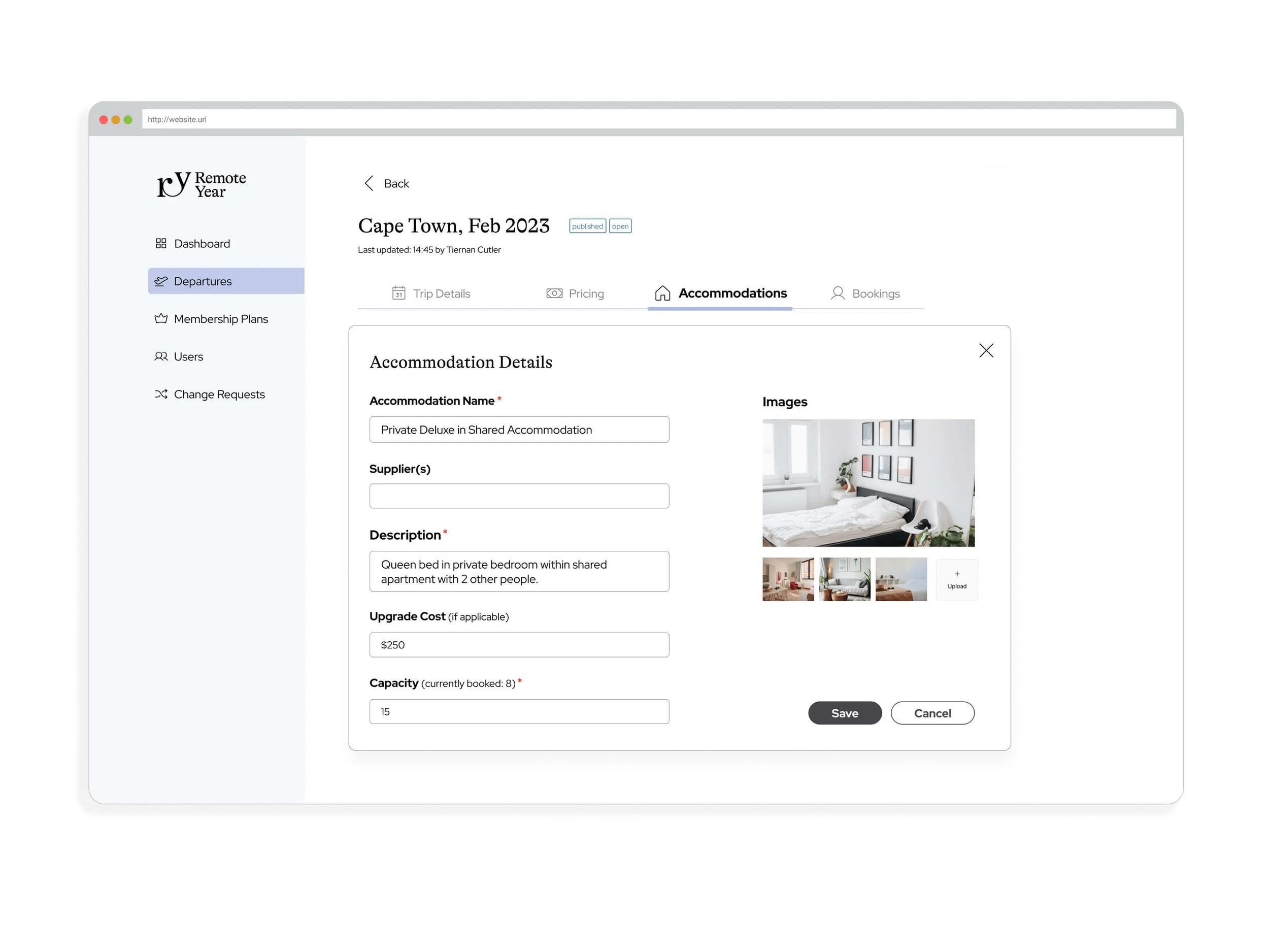
Accommodations Inventory Tracker
When users book their trip on the frontend, they are prompted to pick an accommodation type. With this backend tool, the operations team can easily manage their accommodation types, capacity and inventory.
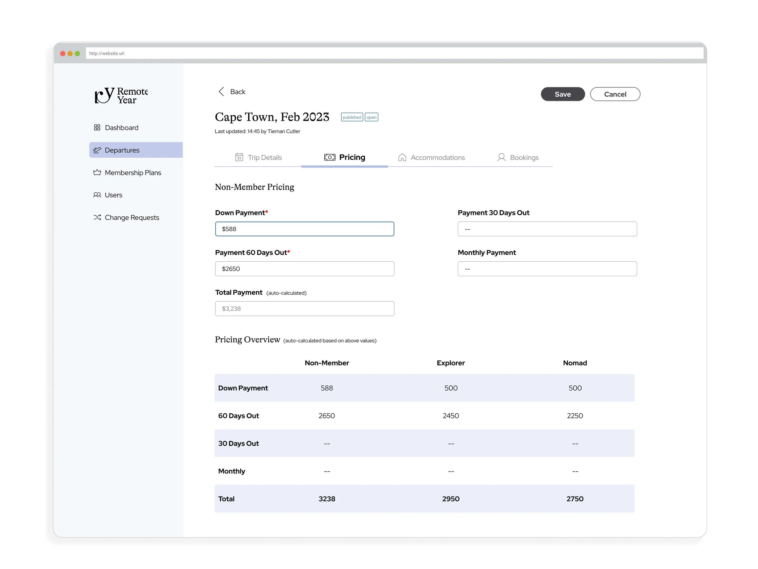
Pricing Tab
We had to create a solution to show the three different pricing tiers that were available to users on the frontend. Beyond that, many of the trips, depending on their length have several payment installations.
These fields were then connected to our booking flow to correctly display the amounts based off a user’s member status as well as how many days out they were from departure.
The Pricing Overview chart was a feature requested by the sales team so they could quickly communicate to leads the payment breakdown.
Users Database
We were acquiring new members and new users everyday but were relying on Hubspot. We instead wanted to migrate our user database to our backend to then be able to link all their necessary information. This users landing page was meant to serve as a quick overview of their key information then if someone on our team needed to learn more about the user they could click on their name and it would expand into their account details
User Trip & Payment Information
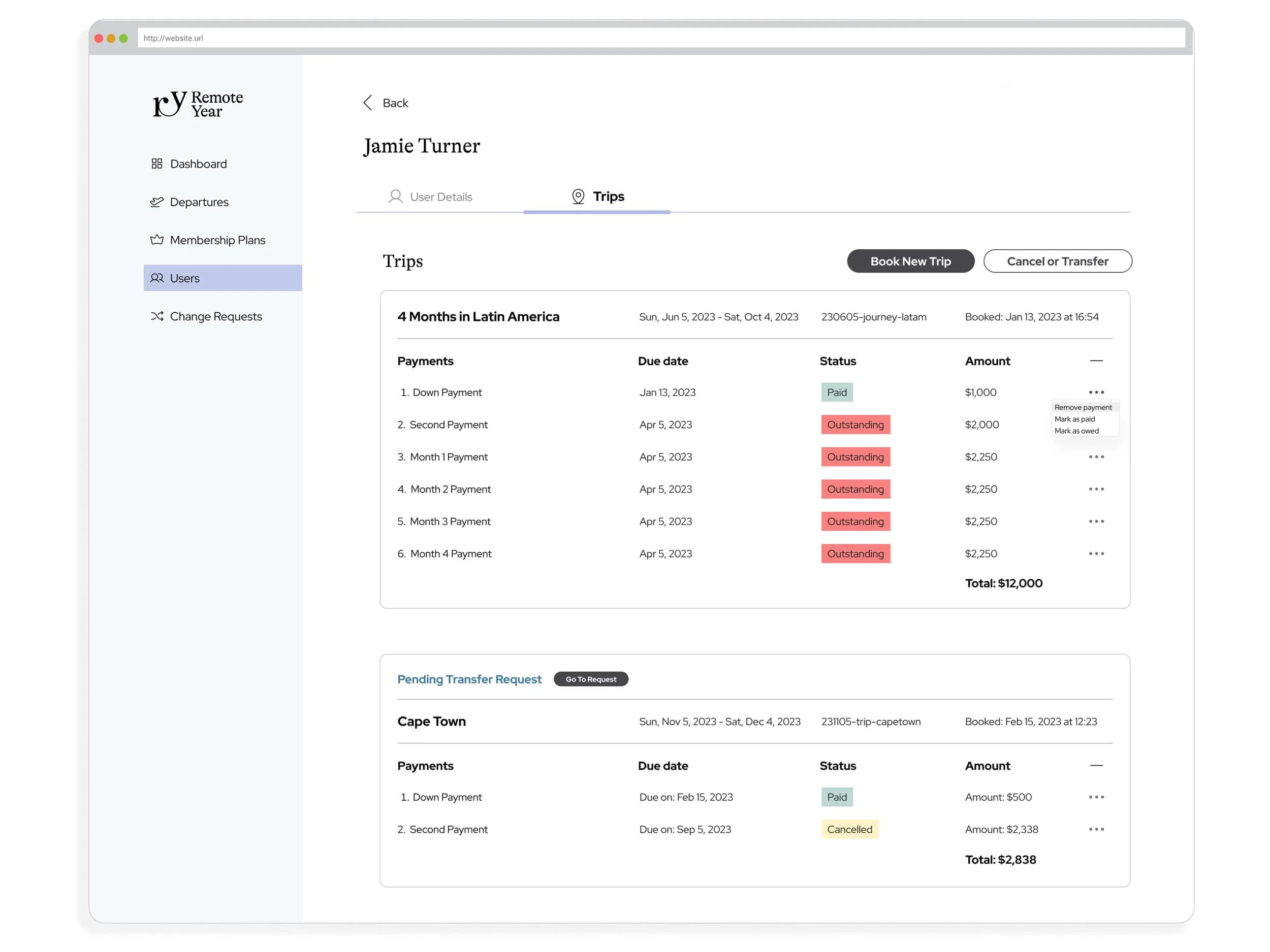
Beyond the basic information such as name, email, contact information our operations and sales departments had to be able to track a user’s bookings as well as payments. In this solution agents can easily see which installments have been paid, what amounts are still outstanding and if the user has submitted a request to transfer or cancel one of their trips.
Another feature we added was for agents to be able to book a user onto a new trip directly from the backend account rather than having to direct a user to the frontend marketing site as they had done in the past.

